Enhancing Component Discoverability and Usability of Prodia’s Figma Component Library
Design Operations, Design Documentation
Overview
Making design work faster and easier by improving component discoverability.
As our team scaled the U by Prodia design system, our growing component library became harder to navigate, especially for designers less familiar with the system. In this project, I took ownership of redesigning the Figma library to make components easier to discover, understand, and use correctly. This included organizing components into clear categories, standardizing naming conventions, adding usage guidance, and building more intuitive search patterns. The result: a more usable design library that reduced friction and encouraged proper component usage across the team.
Prodia is one of the clients of Aleph Labs Indonesia, the creative engineering company I currently work for. Prodia operates hundreds of clinical laboratories across Indonesia, offering a range of health services including lab tests, vaccinations, doctor consultations, and health plans. Our team is developing three essential digital platforms for Prodia: the Patient App, the Doctor & Health Coach App, and the Admin website. These platforms aim to digitize Prodia’s services, streamlining processes and enhancing convenience for patients, healthcare professionals, and clinic staff.
The project is fast-paced, involving three designers collaborating with a sizable engineering team to ensure efficient feature delivery. The primary goal is to elevate Prodia’s digital offerings while prioritizing timely feature rollouts. Due to these tight deadlines, the design team often focuses heavily on delivering results, sometimes at the expense of proper documentation through the component library.
The Challenge
When I joined the project as a new designer, it had already been running for eight months. From the start, I faced difficulties understanding the existing design rules when working on specific pages or components for each platform. One of the major challenges was locating components within the component library. I often needed to ask other designers to determine if a component already existed and could be reused. Even when I found a component, it wasn’t always clear whether it was applicable across all platforms or specific to one, adding more confusion. As the team worked on new features, new components were frequently created and added to the library. Unfortunately, these components were often forgotten during later development stages. The library had become cluttered with a large number of components, making it challenging to locate what was needed.
Initial component library: Crowded with many components all on one page.
Some components were similar in function but had been unnecessarily duplicated, instead of being reused, leading to redundancy.
Initial component library: The Add Food and Address Selection components have similar functions but were duplicated instead of being reused.
Others shared the same functionality but were in different forms, without clear guidelines on when each should be used.
Initial component library: Card Selection and Questionnaire components, both used for the questionnaire page, appear in different forms without clear guidelines on when to use each.
Outdated components were also present, which added to the confusion. Additionally, the lack of a consistent naming convention for components made the library more difficult to navigate.
Initial component library: Inconsistent naming conventions in Tooltip components, with one named ‘Tooltip/Consultation Schedule’ and another named ‘Card/User Profile/Tooltip’.
All these issues contributed to design inconsistencies and created obstacles for efficient design work.
What I Do: Refining the Library Structure
To improve our component library, I took the initiative to refine its structure. The primary goal of our component library is to ensure consistency across all platforms. I want designers to check the library each time they work on a task (or we commonly refer to as Epic). Before they create a new component, I encourage them to first assess whether there is an existing component that can be reused or adjusted for their specific needs. To facilitate this, I aim to make each component as easily discoverable as possible.
I proposed a new structure to the other designers using a branch in Figma, and once everyone was on board, I merged the branch into the main file. We then divided the work to tidy up the components. During this process, we audited the components in parallel, allowing us to identify and flag any components that were no longer in use.
The component library now consists of several key pages:
1. Guideline
This page provides users with guidance on when to create a new component, when to use existing ones, what steps to take after creating a component, naming conventions, and how to update components.
The new component library: Guideline page, offering guidance on when to create new components, when to use existing ones, steps to follow after creating a component, naming conventions, and how to update components.
2. To Update
This section allows designers to submit new components/component updates, which will later be reviewed for compliance with design rules and naming conventions. As the design system maintainer, I will then move and ensure these components are updated on the appropriate pages.
Component updates are categorized based on the Epic name, as new components and updates are typically created within specific Figma Epic files. Consequently, the same component may have different version updates listed on this page. The order of updates will follow the development sequence for each Epic; for example, components from Epic slated for development in version 2.0 will be updated before those from version 2.1.
The new component library: page to submit new components/component update.
Here, users can find the brand logo, typography, color palette, and shadow styles utilized in the Prodia platform.
4. Icon & Imagery
This page contains the icons and illustrations used throughout the Prodia platform.
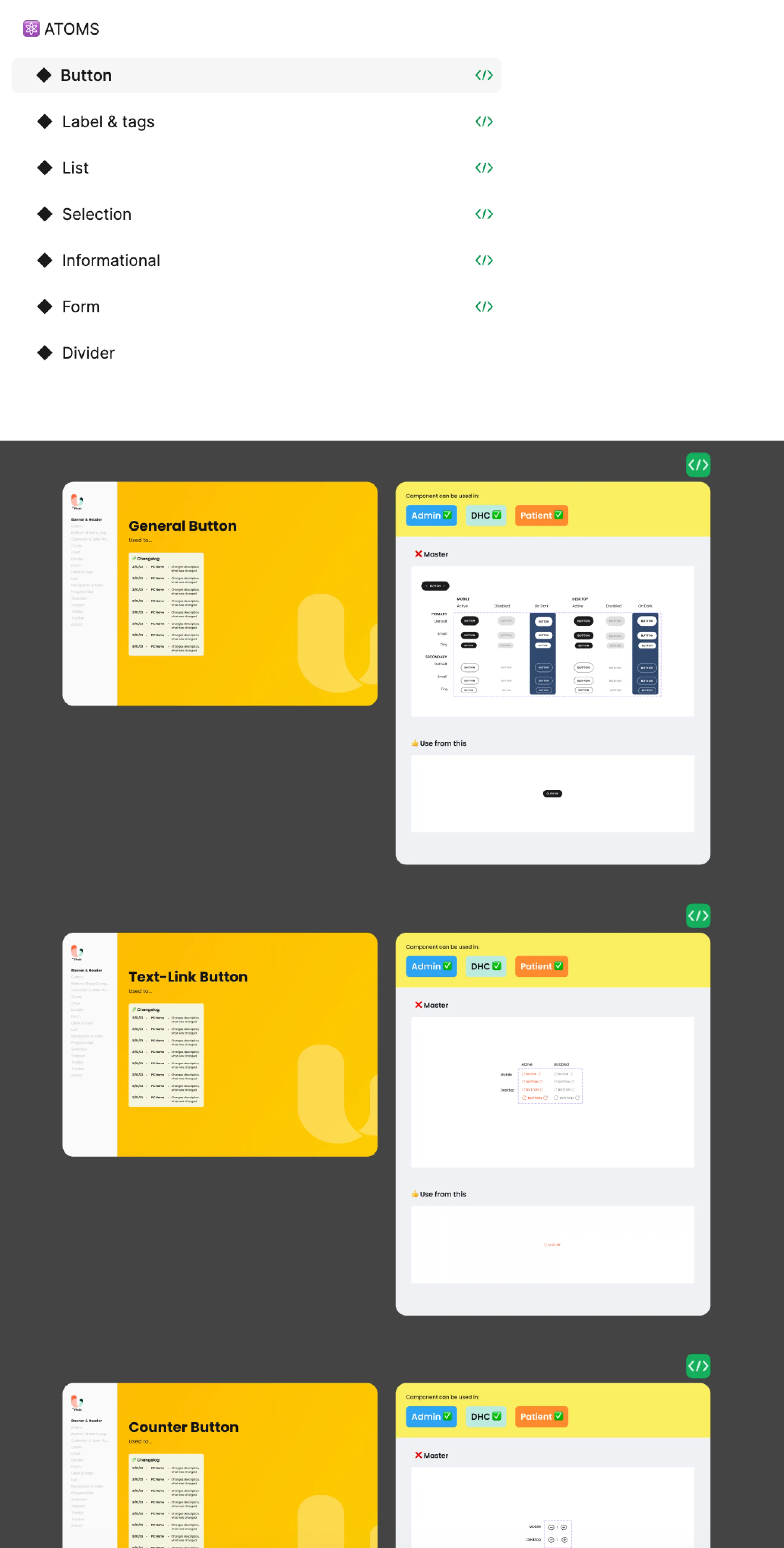
5. Atoms & Components
Atoms are the fundamental building blocks used to create components. Designers should first check this section when considering the creation of a new component. An example of an atom is buttons.
The new component library: Example of Atoms page for Button.
Components are collections of elements that constitute parts of the app and platform we’re designing, such as bottom sheets.
The new component library: Example of Components page for Bottom sheet & Pop up
Each atom and component is now organized into individual sections for easier navigation, in contrast to the previous component library, which grouped all components together on a single page.
I also indicate which components are applicable to specific platforms: the patient app, the doctor and health coach app, or the admin platform.
For cards, given the numerous components available, I categorized them based on usage — such as general use, loyalty and rewards, purchasing, or business services — making it easier to locate the required cards among many options.
Usage examples for each component are included to provide context on where and how specific components are utilized.
6. Template
This section features the main pages commonly used in the platform we’re building.
7. Toolkit
Here, users can find helper components for our Figma file and design system, including design change logs and connecting screens.
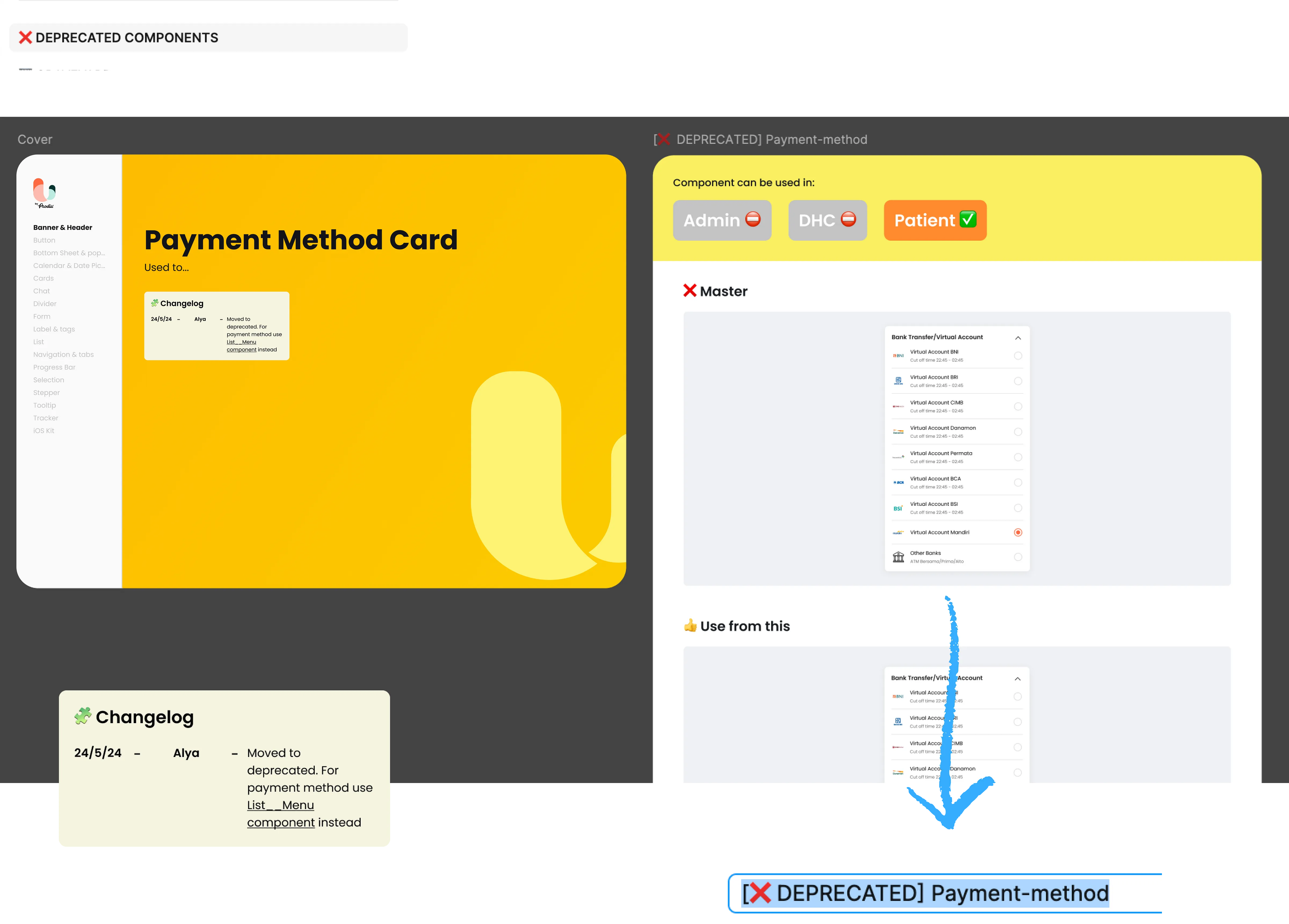
8. Deprecated Components
This page lists deprecated components, along with explanations for their removal and links to the new components.
What I do: Implement Component Naming Standard
Previously, there was no standard naming convention, leading designers to name components differently based on their preferences. This lack of consistency creates several problems:
Inconsistent naming leads to different terminology for similar components, making it challenging to understand the system as a whole and causing confusion.
Team members struggle to find the components they need efficiently. Designers may inadvertently create duplicate components, unaware that similar ones already exist.
Lead to misunderstandings and miscommunication, making teamwork more difficult.
Documentation becomes less effective — It can be challenging to write clear, actionable guidelines when the naming varies.
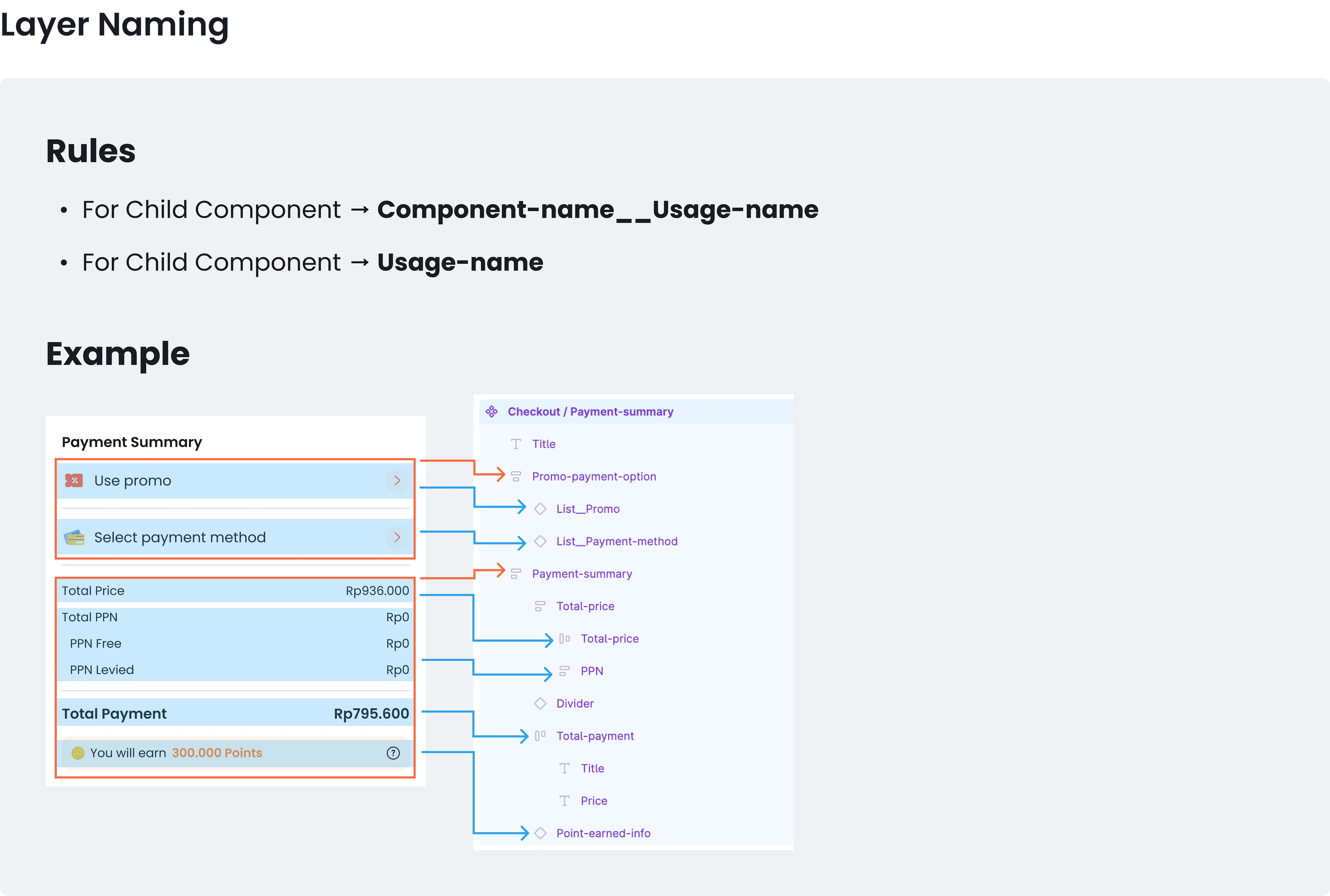
To address these issues, I researched and adopted the BEM (Block Element Modifier) naming convention for component and layer naming, as I found it easy to understand and commonly used in programming environments. For more details, you can read about the Figma Component Naming Convention by Santiago Mollajoli here.
Additionally, to make prop names easier to differentiate at a glance, I’m implementing emojis in front of prop names.
The implementation of this naming standard facilitates collaboration with developers as they work to build the component library from their side.
How the Solution Works
During the product team’s retrospective session, the component library restructure was recognized in the “What Went Well” section for its positive impact on enhancing the design workflow. Other than that, through this restructuring, the design team has experienced the following improvements:
Easier Component Location: Finding necessary components has become significantly simpler.
Identification of Inconsistencies: The new system highlights inconsistencies within existing components and establishes clear rules for component design and usage.
Encouraged Organization: It promotes a more organized process for creating and updating components.
Foundation for Collaboration: This restructuring provides a solid base for collaboration with the development team in building the component library from their side.
Throughout this process, I learned that understanding the project’s daily workflow is crucial for establishing an effective library structure. Additionally, investing time upfront to organize the component library appropriately can enhance design efficiency in the long run. If the library isn’t utilized correctly from the start, inconsistencies can arise, leading to long-term challenges.


.png)
-1.png)
-2.png)
-3.png)

