Redesigning U by Prodia's Health Score for a More Personalized and Connected User Experience
Experience Design, Visual Design
Overview
Turning a low-engagement feature into a meaningful health companion through clearer flows and actionable results.
As the designer in charge of this task, I explored the problem through hands-on usage and analysis of existing user research. I categorized key pain points, mapped them to potential solutions, and collaborated with business and system analysts to ensure technical alignment. I designed and iterated on the new experience, presented the solutions to stakeholders, and prepared clear, developer-friendly design documentation to support implementation.
Prodia (PT Prodia Widyahusada Tbk) is a health service company that has been established since 1973. Prodia has hundreds of clinical laboratories spread throughout Indonesia. As a UI/UX Designer at Aleph Labs Indonesia, Prodia is one of the clients I work with, and one of their key digital platforms is the patient app, U by Prodia (UbP).The UbP application is a comprehensive health management tool where users can:
Manage and book health services like lab tests, vaccinations, and doctor consultations.
Purchase medicines, supplements, and personalized health plans.
Track and manage chronic conditions like diabetes.
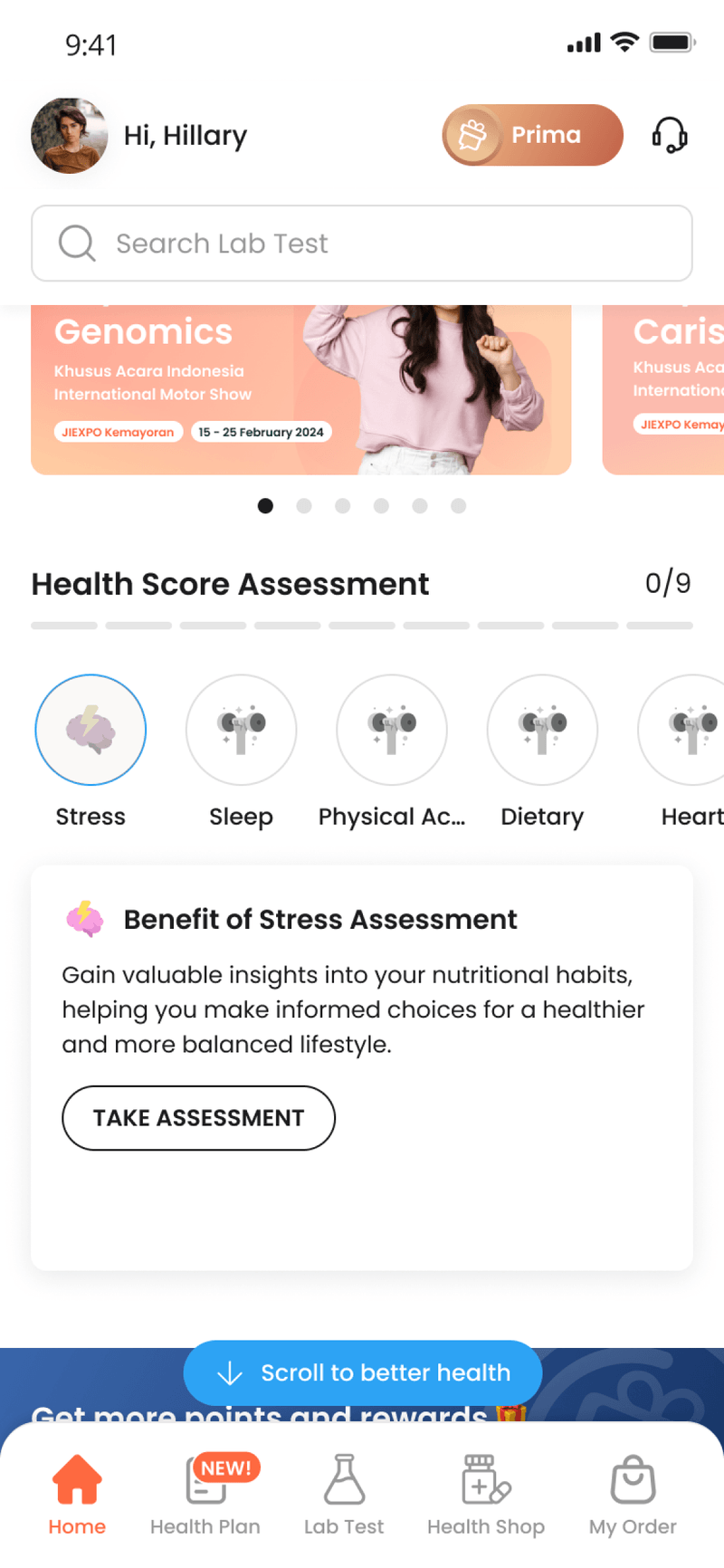
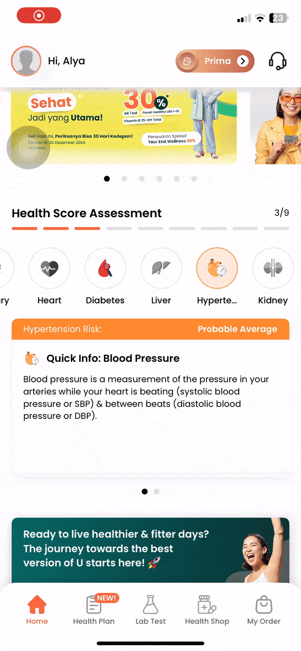
Other than that, UbP also has a Health Score feature which allows users to take assessments to evaluate their risk levels for diseases, including diabetes, liver disease, heart disease, kidney disease, and hypertension, as well as evaluate lifestyle factors, including sleep quality, stress levels, dietary intake, and physical activity.
The Problem
The Health Score feature plays a pivotal role in UbP as it generates personalized health recommendations for Prodia’s services. However, despite its importance, only 2% of users actively engage with the feature. Through this redesign, our goal is to uncover the reasons behind the low engagement and address the underlying issues to enhance its value and usability.
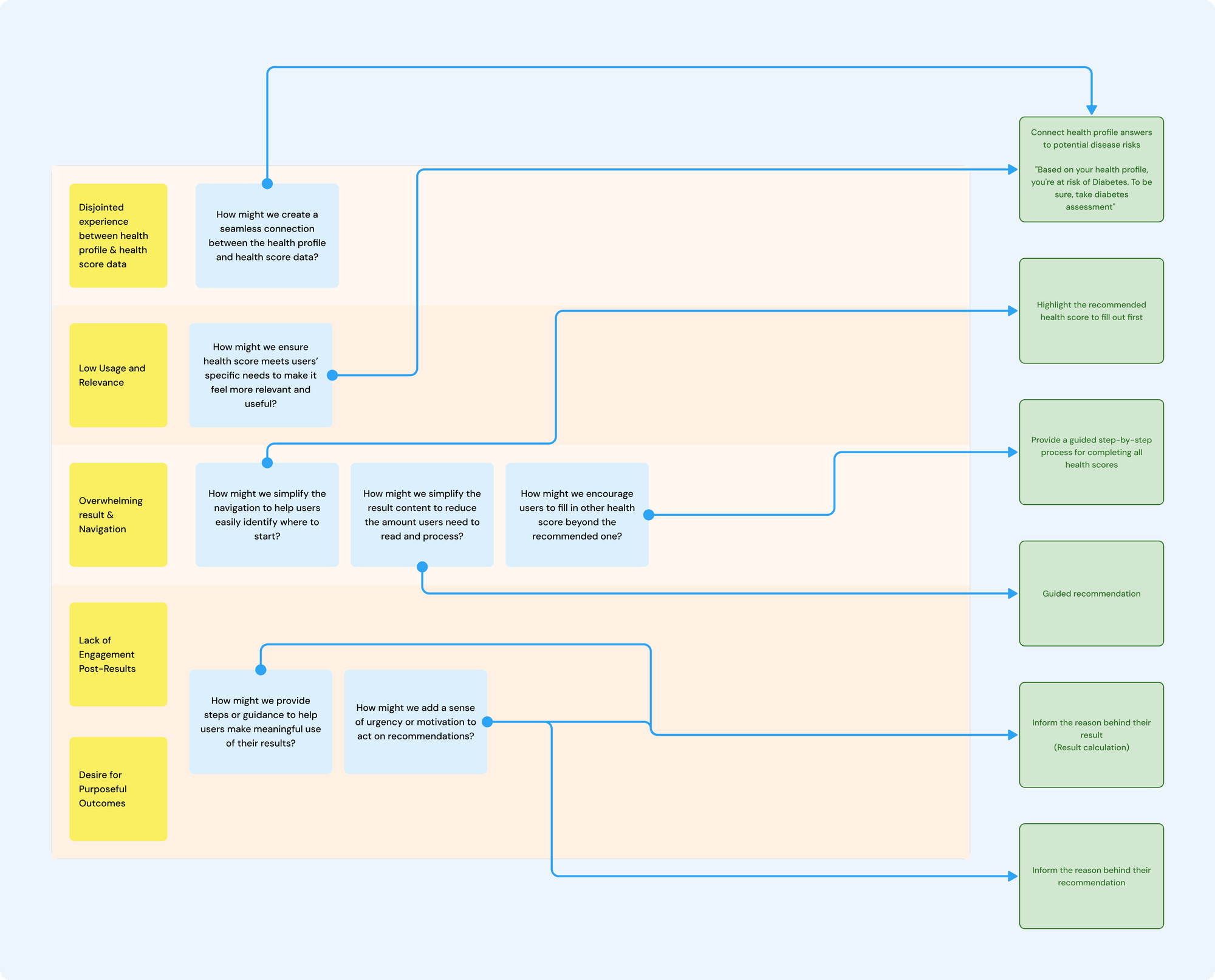
Understanding the Problems
To understand the problem with the current Health Score, I began by re-experiencing the feature to recall my own user experience. The main issue I felt was that the process felt jumpy and disconnected, particularly between the onboarding survey and the health score assessment.
When users create a UbP account, they are prompted to fill out an onboarding survey to provide information about their personal and family health conditions, body measurements (BMI and blood pressure), and habits such as smoking. These responses are saved in a page called Health Profile and directly influence the health score result. However, there is a noticeable disconnect between the two, as users are not shown how the data they input in the onboarding survey is used in the health score assessment.
Additionally, insights from a usability test, conducted to understand how existing UbP users interact with the app, revealed several issues with the health score feature. I compiled the findings into a Miro board, categorizing them into:
Low Usage and Relevance: users find the feature underutilized and misaligned with their needs. They are often using the app for specific services or content instead.
Overwhelming Navigation: the feature has too many menus, making it unclear where users should start.
Lack of Engagement Post-Results: users view the results as just scores without actionable follow-ups or urgency and few revisit their results after the initial assessment.
No Purposeful Outcomes: users perceive the feature as simply a way to promote Prodia’s products, offering no meaningful recommendations.
To ensure that all concerns were addressed, I created How Might We questions based on the identified problem categories and began ideating potential solutions.
Designing the Solution
From paper sketches to high-fidelity designs in Figma, I began creating design concepts for the key screens: the entry point and result page. Through ongoing discussions with my lead, the business analyst, and presentations to the client, we collaboratively refined the ideas and ultimately agreed on the design outlined below:
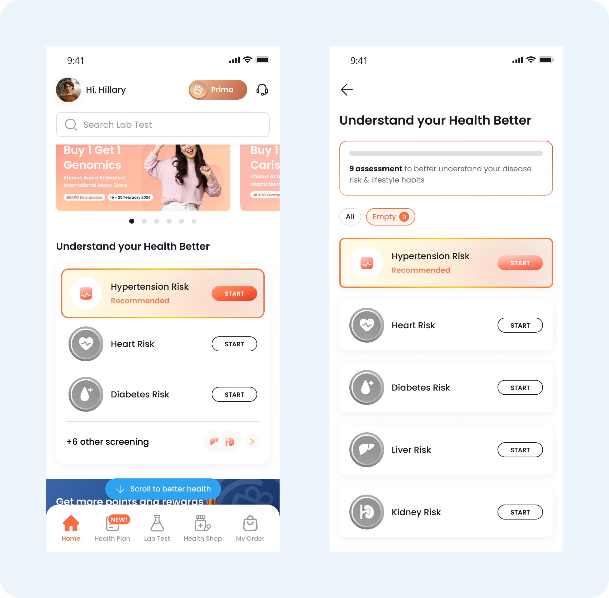
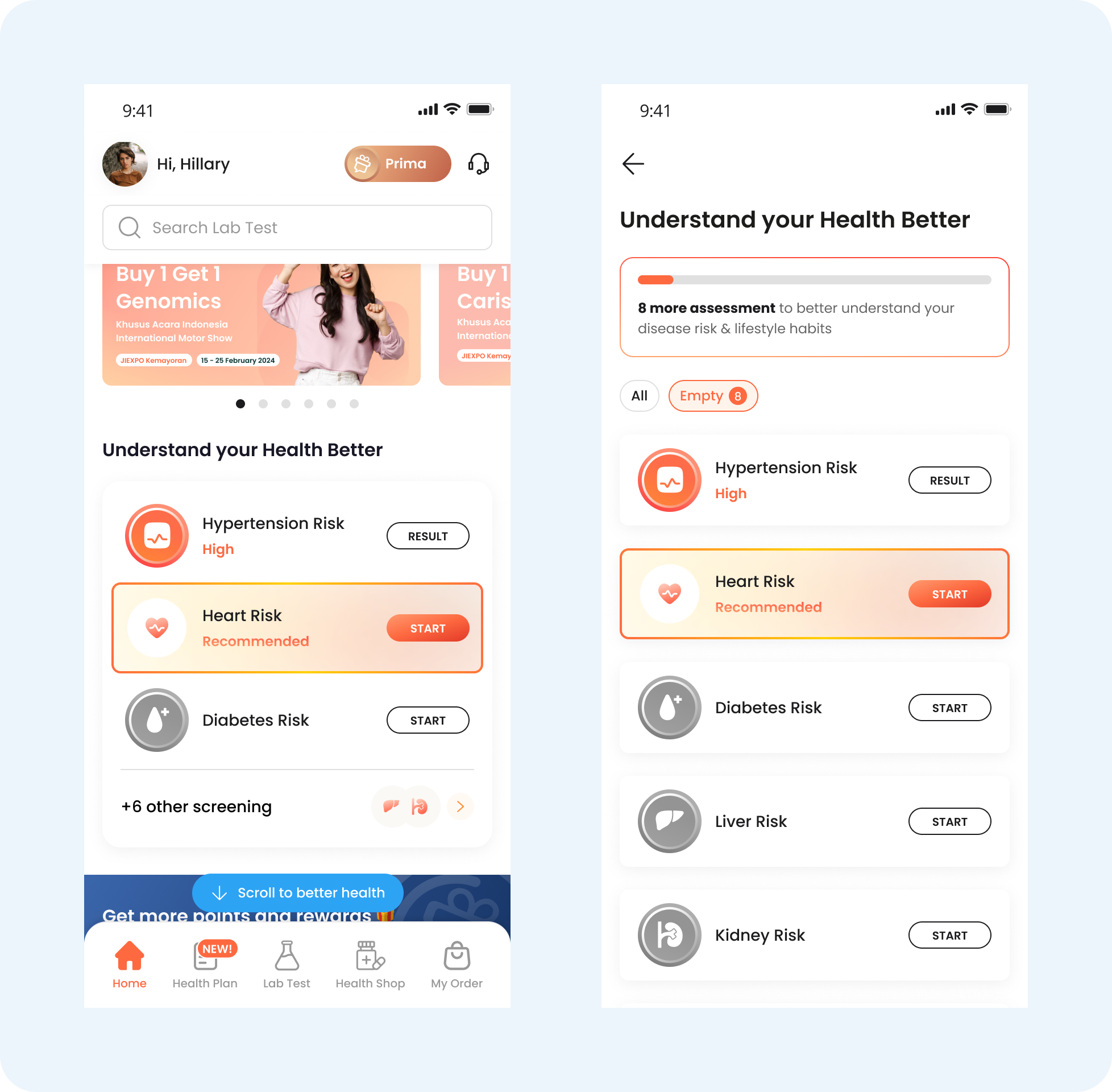
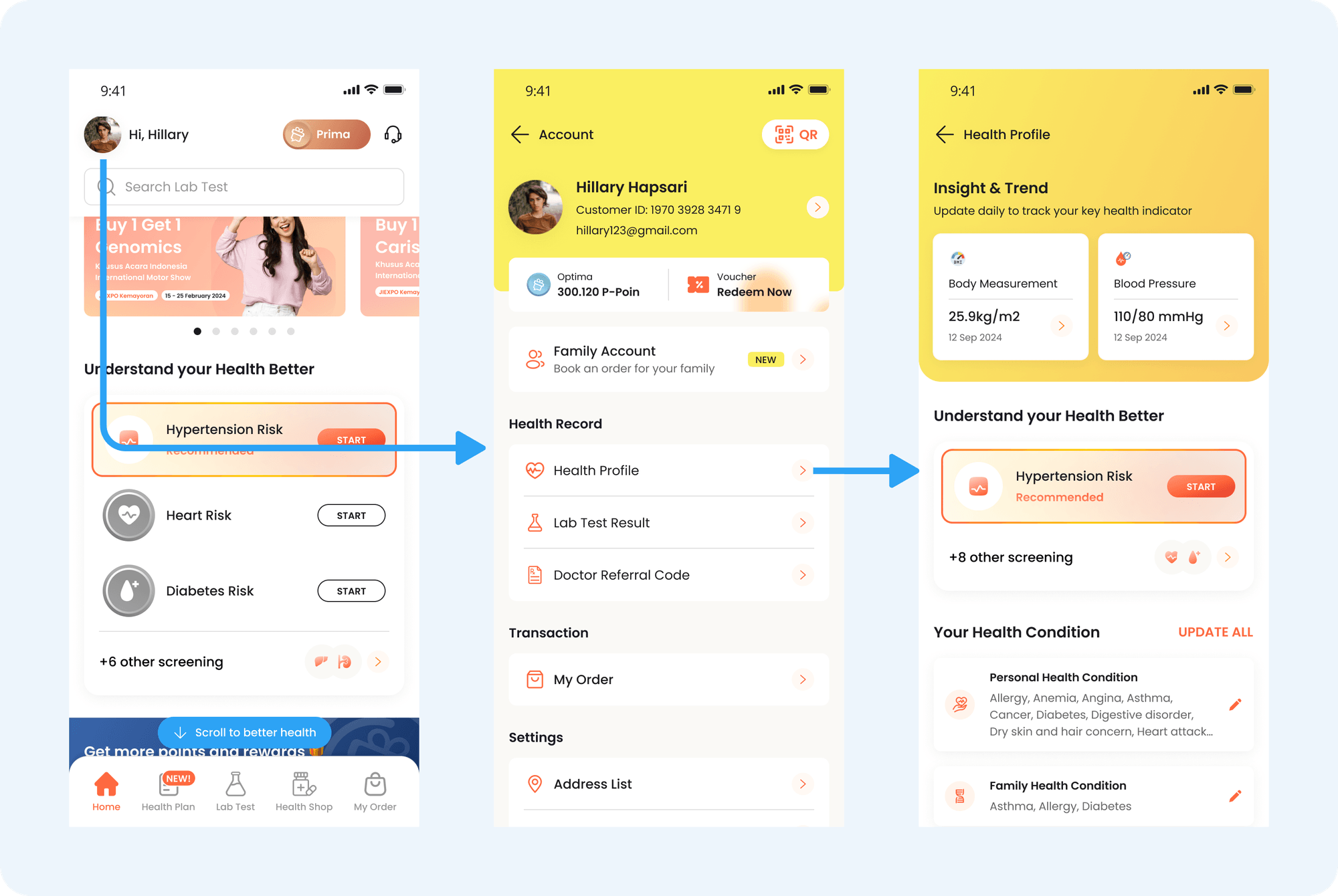
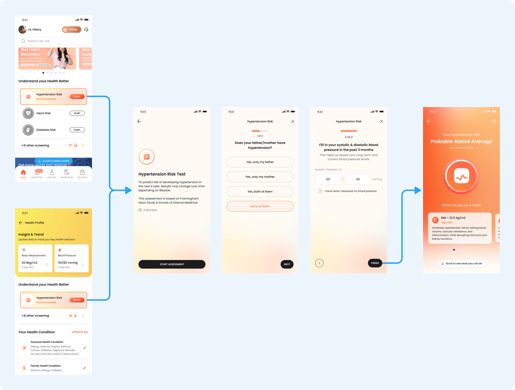
Entry Point
The current entry point: overwhelming navigation leaves users unsure of where to begin.
🎯 Refinement Focus:
Highlight the recommended health score to fill out first
Provide a guided step-by-step process for completing all health scores.
The "Recommended" label helps users avoid confusion about where to start. The assessment list are ordered based on general diseases, which can lead to or be related to other conditions.
After completing the recommended assessment, the "Recommended" label shifts to the next assessment, guiding the user on what to do next. This encourages them to complete the assessments gradually, making the process feel more manageable.
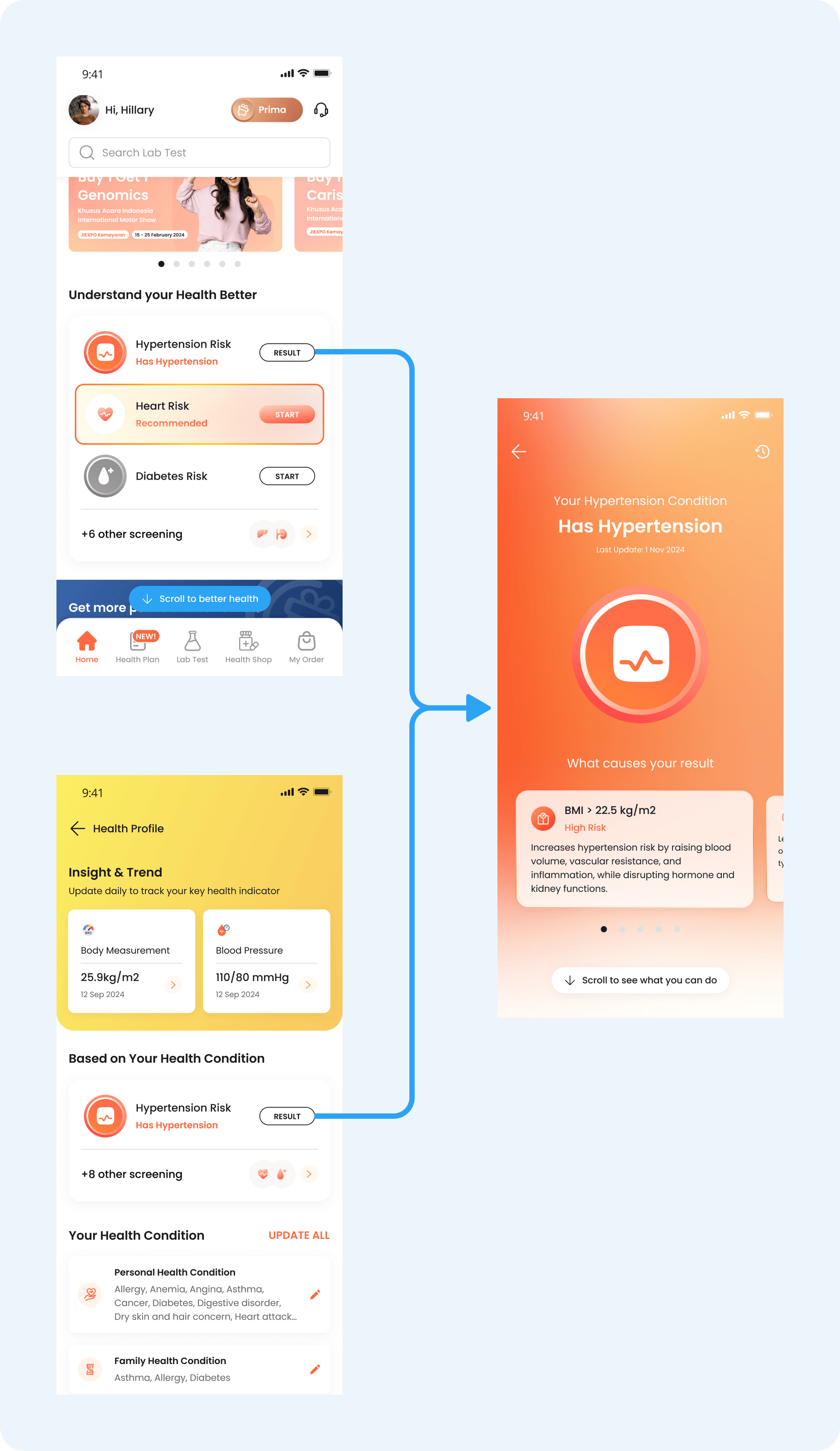
In addition to accessing the health score from the homepage, users can also view it from the Health Profile page. The Health Profile contains the user's initial health data, which they entered when creating their UbP account. This reinforces the connection between the health profile data and the health score result, helping to demonstrate how the two are linked.
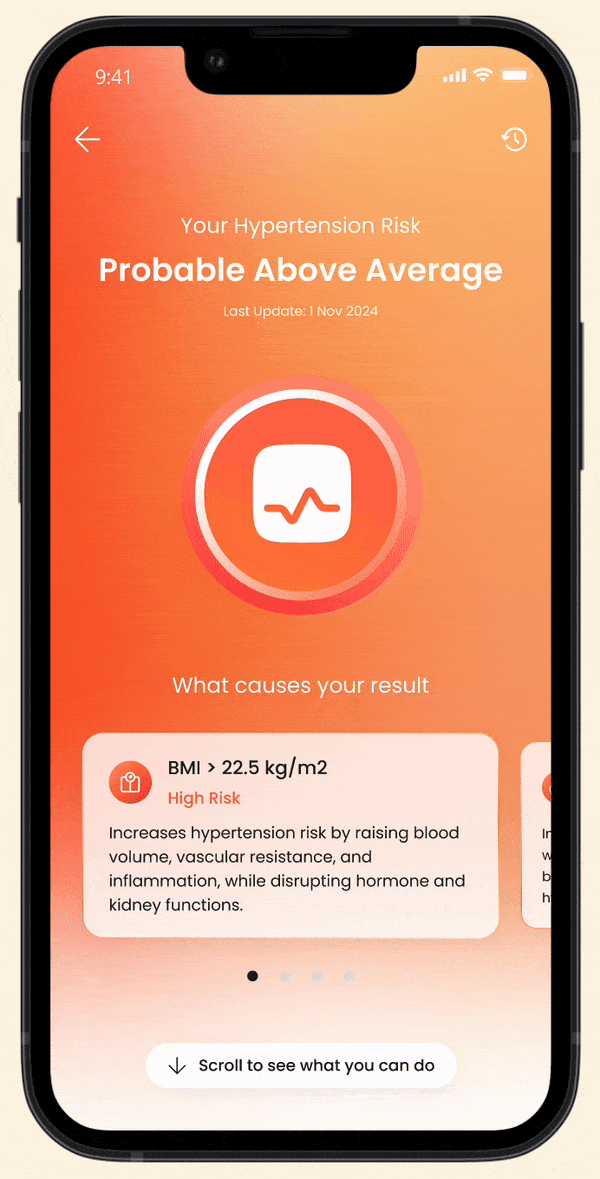
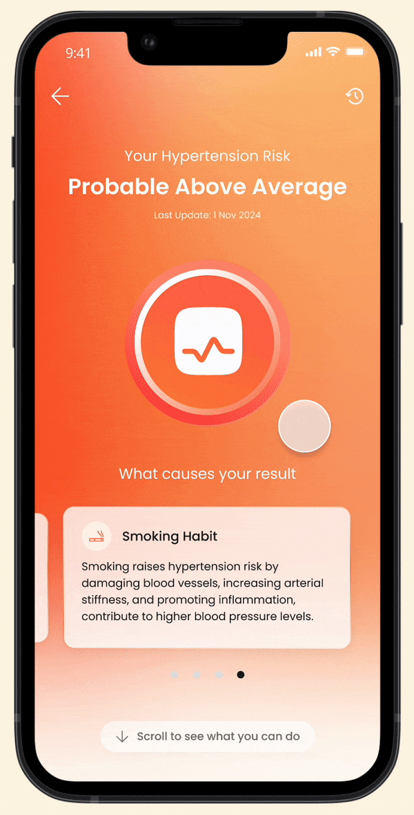
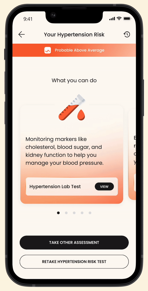
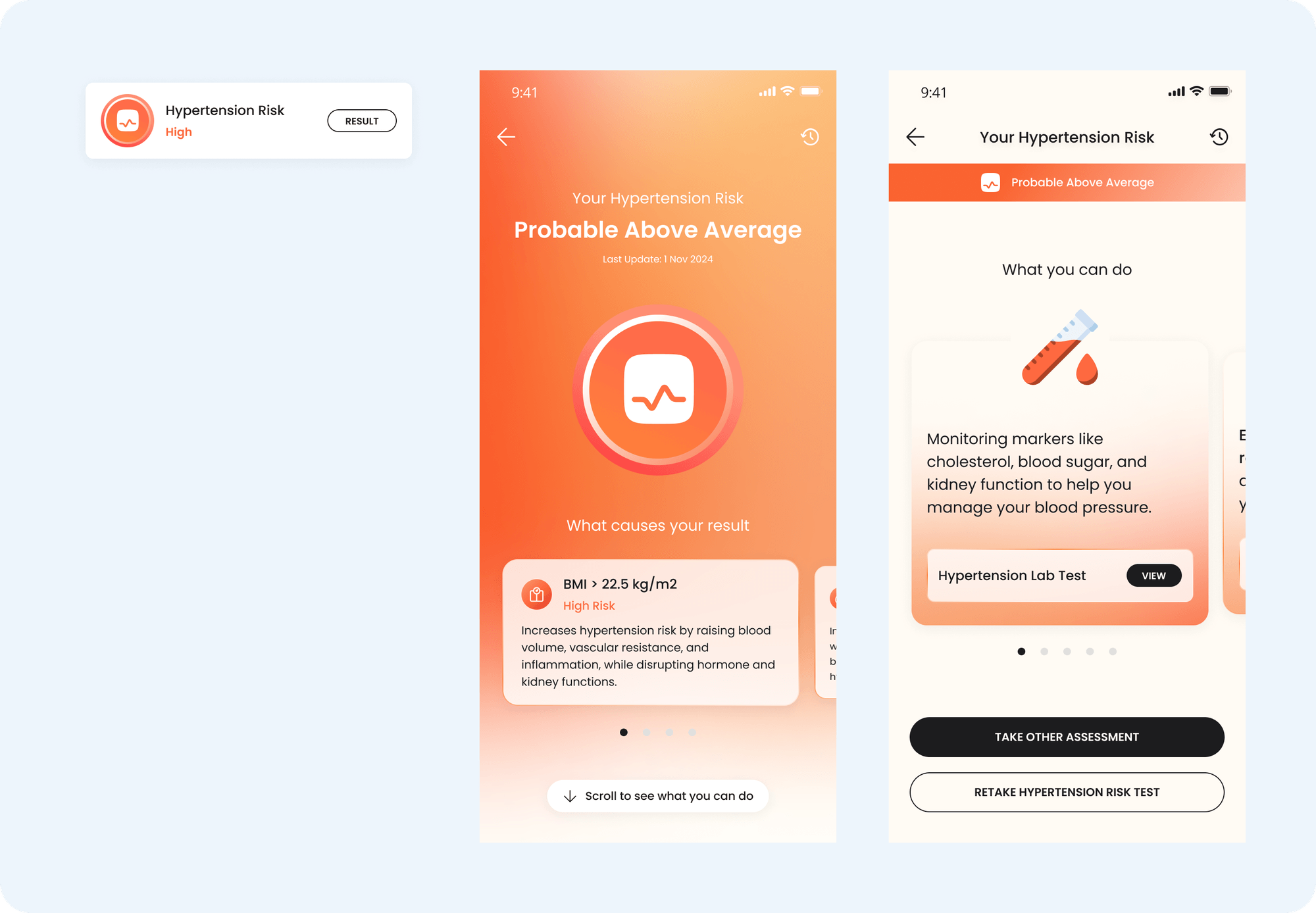
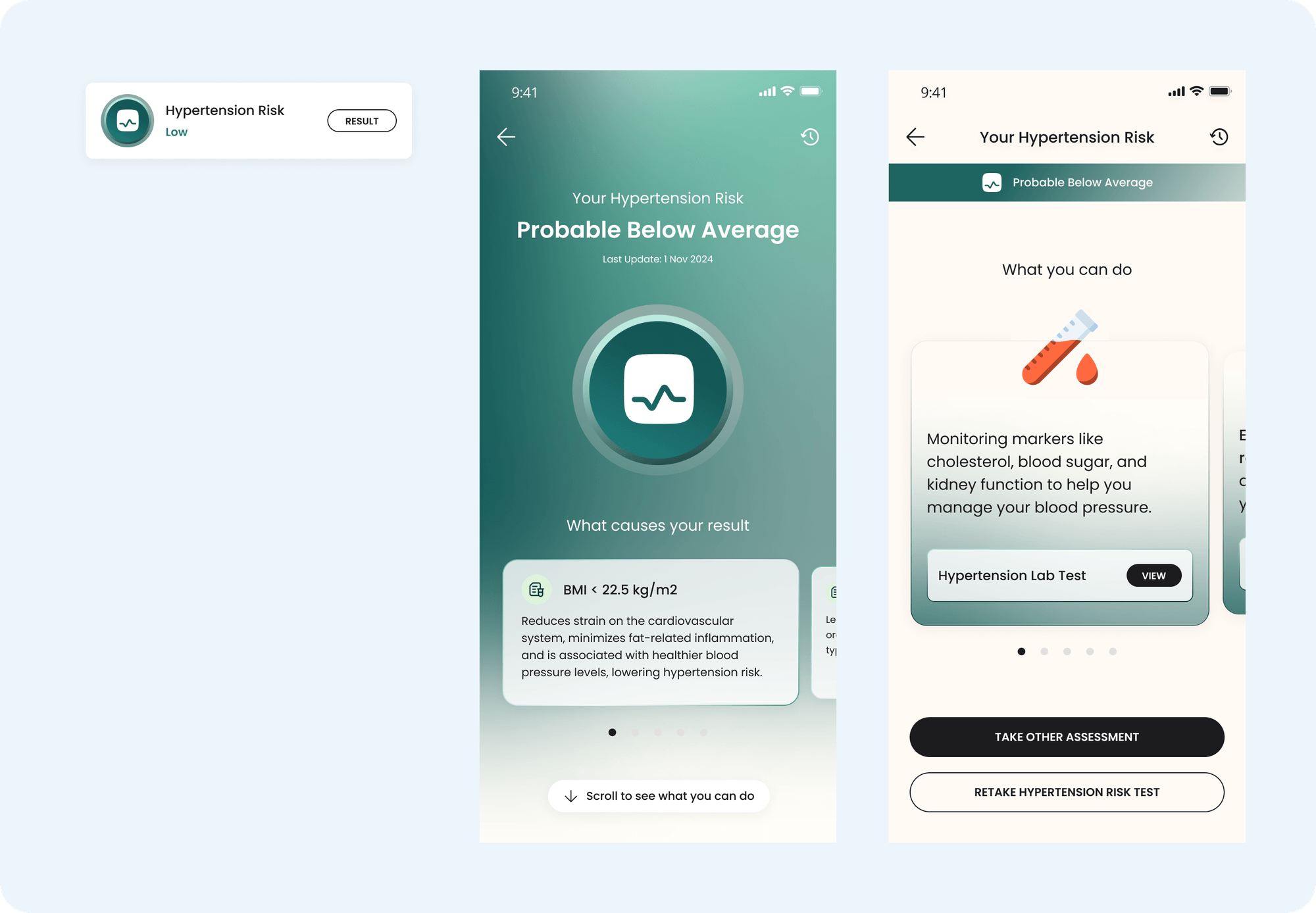
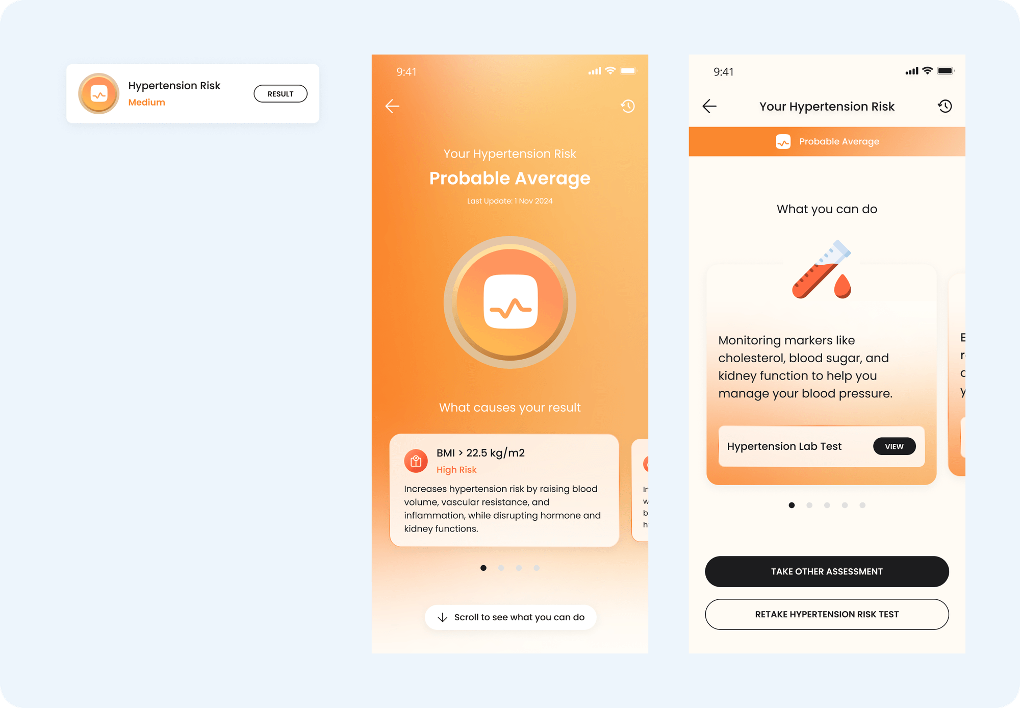
Result Page
The current result page:
Lack of Engagement Post-Results
No Purposeful Outcomes
Overwhelming content
🎯 Refinement Focus:
Inform risk factors: Clearly explain the reasons behind the assessment results.
Provide rationale for recommendations: Help users understand why specific recommendations are given.
Guided recommendations: Offer step-by-step guidance on actions users can take based on their results.
To drive user engagement with the assessment results, we realize how essential it is to clearly communicate the reasoning behind their outcomes. We also highlight the highest risk factor and emphasize its contribution to the result. This approach create a sense of urgency that motivates users to take action on the provided recommendations.
In the first fold, users can focus on understanding the reasons behind their results. Once they grasp the "why," they can scroll to the next section to explore actionable steps. This approach helps users process information step by step, preventing them from feeling overwhelmed by too much content at once.
We also explain the reasoning behind each recommended action, helping users understand the purpose behind our suggestions. This ensures the recommendations are perceived as meaningful and tailored to their needs, rather than just an attempt to cross-sell Prodia services.
The recommendation, which may consist of multiple items, will be presented in a bottom sheet with a clear and intuitive call-to-action. This approach allows users to first focus on understanding the reasoning behind the recommendation and view the suggested items as meaningful, curated solutions tailored to their condition. It also prevents users from feeling overwhelmed by a long list of recommendations all at once.
Additionally, we visually differentiate results—good, average, and bad—by using distinct background colors. This design choice ensures that the emotional tone of the assessment result is immediately clear and resonates with the user. A striking background color not only makes the outcome more noticeable but also helps users quickly identify their health status, whether it is positive, concerning, or neutral, without needing to read through the entire content. This approach enhances the user experience by making the results more intuitive and emotionally impactful.
Entry Point & Result Page
🎯 Refinement Focus:
Connect health profile answers to potential disease risks
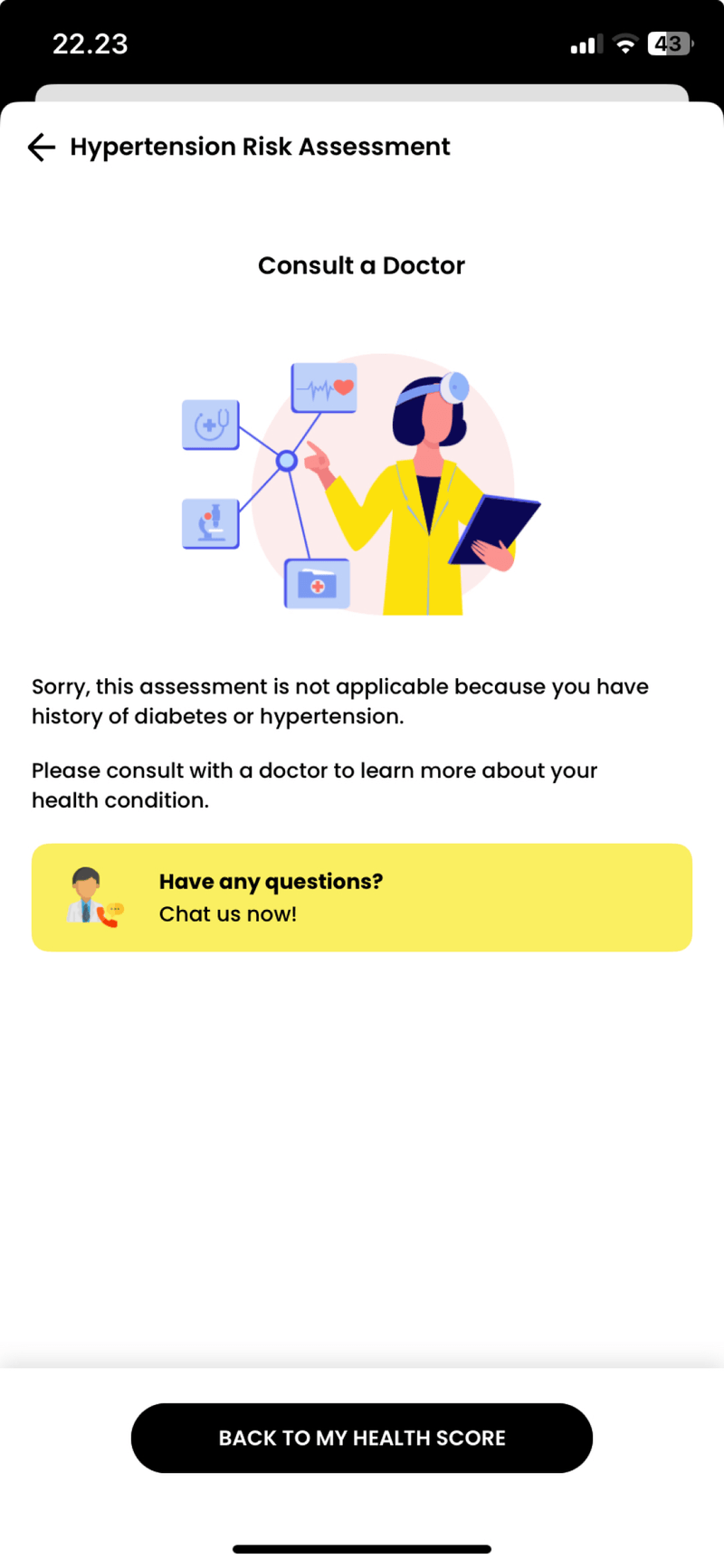
In the health score feature, certain medical limitations currently prevent some users from completing specific assessments. For example:
Weight exceeding 160 kg
A personal history of hypertension, diabetes, heart, kidney, or liver conditions
HbA1c results between 5.7%–6.4%, indicating a pre-diabetes condition
Previously, users meeting these criteria were redirected to a disclaimer page after selecting an assessment, informing them that they were ineligible to proceed. This experience was not ideal because users would only discover their ineligibility after deciding to take the assessment, leaving their health score empty and creating frustration.
Now, users with these conditions will directly see their disease result without needing to complete the assessment. Clicking on the disease menu will take them to a pre-populated result page. This approach achieves several improvements:
Transparency: Users are informed upfront without a disruptive experience.
Data Connection: It reinforces the relationship between the health profile data and the results.
Relevance: The health scores better reflect the user’s current medical condition and specific needs.
If a user doesn’t have a pre-existing condition, clicking on the health score menu will redirect them to the assessment flow. This differs from users with existing conditions, who are taken directly to a pre-populated results page.
How the Solution Works
Following multiple discussions, including input from the client, we finalized the design, flow, and permutations. The development of this feature is planned for an upcoming development cycle.
Early feedback from stakeholders and internal teams has been extremely positive, with the new interface addressing all concerns raised during the enhancement process. Key improvements include:
Increased Relevance: The new interface has better alignment with users' needs and usage patterns, making the health score more meaningful.
Enhanced Engagement: The results and recommendations are now more relevant and actionable, encouraging users to actively engage with the assessments.
Simplified User Experience: We've streamlined the process, making it easier for users to understand where to start and guiding them through the assessment in a logical and non-overwhelming way.
Clear Data Connections: The new design effectively shows the connection between the health score and data from various sources.
With these improvements, we are confident that the new health score feature will drive a significant increase in user participation, potentially boosting the number of takers by more than 2%.
Lessons Learned
✍️ Understanding the existing system's foundation
Gaining a deep understanding of why the existing system was built the way it was allowed us to identify areas for improvement. This foundation provided valuable insights that helped us shape a more effective solution for the new feature
🗂️ Maximizing design documentation beyond visual design in Figma
Handling the dynamic nature of health score calculations was one of the most significant challenges. A single user’s result could be caused by different factors compared to another user's, leading to a wide range of case permutations. To manage this complexity, we utilized collaborative tools like sheets to map out these dynamic factors systematically. This approach enabled us to:
Visualize all possible case permutations in an organized and accessible format.
Provide clarity for stakeholders beyond the design team, including writers and developers, helping them grasp the nuances of each scenario and plan their contributions more effectively.
Bridge the gap between design flows in Figma and real-world logic, ensuring that all edge cases were accounted for without overwhelming anyone with visual overload in a single tool.
🩺 Deepening healthcare domain knowledge
Beyond design expertise, we had to immerse ourselves in medical terminologies, health data, and clinical reasoning to ensure that every recommendation and result reflected real-world relevance. Developing a user-friendly product in such a complex domain required close collaboration with subject matter experts to strike a balance between accuracy, simplicity, and user engagement.
Shotout to
Our project’s business analyst, Fakrianih Hijriyatau, for her crucial role in documenting all potential use cases! Her thorough analysis ensured that every edge case was accounted for, enabling the design to address the complexities of the medical field with precision. Also, Diana Daniela, my design lead, whose insightful feedback and guidance throughout the design process helped refine and elevate the final solution 🤗